Tuesday, October 09, 2007

Pasting Pictures from Keynote to Pages (Bizarre)

Years of working with Microsoft Office has taught me that even when writing a (Word) document, the best policy is to use Excel for tables (and to paste them in as 'Pictures (Enhanced Metafile)' and PowerPoint for pictures (again, pasting in as enhanced-metafile pictures). I automatically transferred this paradigm to iWork '08. It can be made to work, but it doesn't seem to be straightforward.

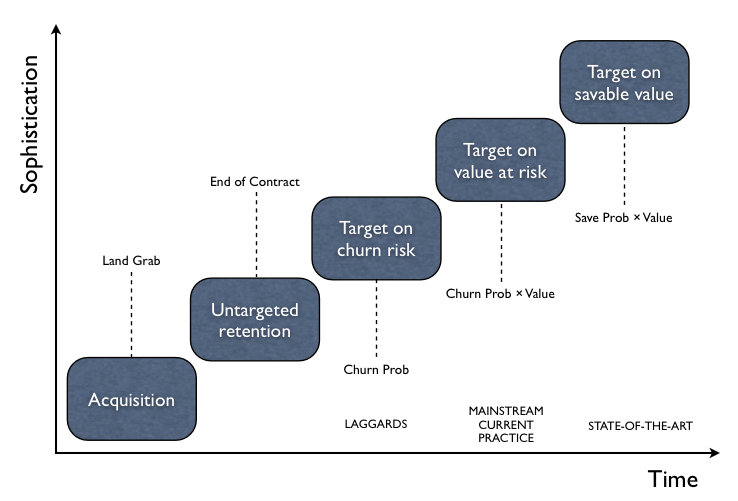
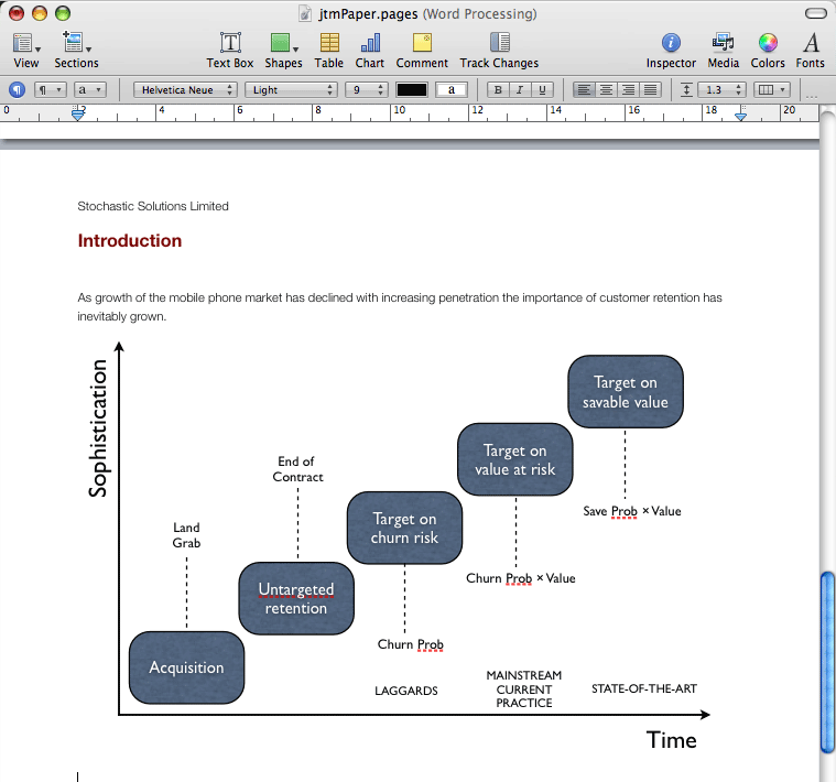
This is the picture I drew in Keynote. It's OK. (I've shrunk it so it doesn't get messed up by all the stuff on the right of the blog.)

Evolution of Retention Strategies (Keynote)

I tried pasting it into Pages two different ways. The first way was grouped. This was the result. (You may have to scroll down a bit to see it.)

Grouped Keynote Imaged Pasted into Pages

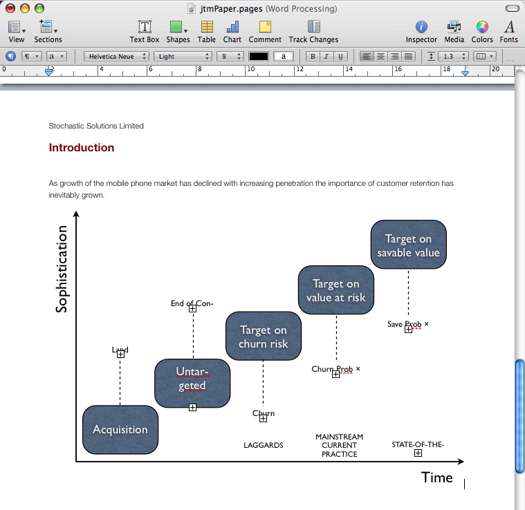
Clearly, the text has all resized itself (despite the fact I changed it to be 'at design size' in Keynote before pasting it in). Everywhere there is a plus sign in a square, like this ⊞, something is broken). And it doesn't look like you can do much with it when it's grouped in Pages. So I tried pasting it in ungrouped. This is the result.

Ungrouped Keynote Imaged Pasted into Pages

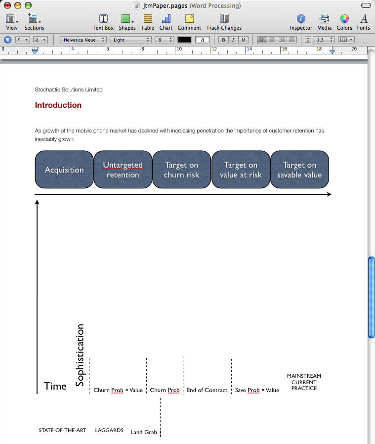
This is just bizarre.

I next wondered whether in fact the picture was slightly too wide and that was causing the problem. (I thought I'd done it at design size, which obviously I ideally wouldn't need to, but I'd only done this by eye. So I tried reducing it a bit further, till I was really confident it would fit. This was better, but bizarrely still not right:

Reduced Grouped Keynote Imaged Pasted into Pages

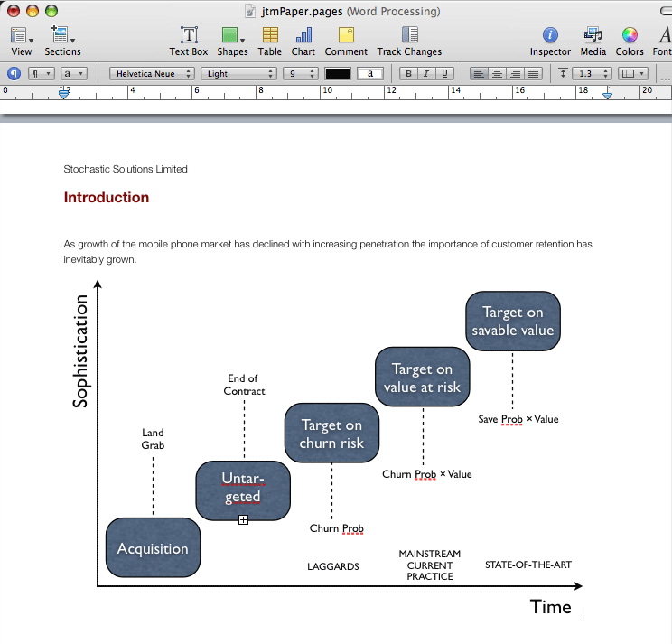
The text second grey box, which should say 'Untargeted retention', is broken. It was 14pt in Keynote and I found even reducing it to 13pt didn't fix this. But if I took it down to 12pt, things were finally OK. Like this:

Reduced Grouped Keynote Imaged With Further Reduced Text Pasted into Pages

Obviously, there may be other options I haven't discovered yet, but so far this looks a bit erratic. I can certainly forgive Pages for screwing up when the picture is wider than the text (especially if there's a way of telling it just to let it be wider), but the strangeness with the text in the box, and even more with the ungrouped image, seems wrong. And I think I would like there to be a way to paste it in as an image (as opposed to a vector drawing that can be manipulated), other than by explicitly converting it to a PNG, a GIF or whatever. If there is, I haven't found this yet.

This raises another point in passing: it doesn't look as if Keynote has a way of reducing the font size 'a notch' for a set of text boxes with different size text. This is useful when you resize a a graphic and all the text needs to go down something like proportionately. As far as I can see (so far), you specify absolute sizes in Keynote, and can only change a set of text boxes all to a common new size. That will be annoying at times.

On the more positive side, Pages does have a built in keystroke for pasting-in text without formatting (or rather, taking on the formatting that it would have had if you'd typed it in instead). I use this all the time, and it's painful in Word. In Pages, you just do OPTION-COMMAND-SHIFT-v. OK, it's not the snappiest, but it works and is "just there".

Labels:

Stupid, Stupid PowerPoint

I mentioned in a previous post that Microsoft PowerPoint had improved, but was still painful to use. This reminded me of one of its most painful (and elementary) user interface errors in some previous (I think!) version.

A few years ago, I started up PowerPoint on a new installation of Office and it greeted me with a big box in the middle of the screen that offered three choices. I don't remember exactly what they were, but they were something like 'Open an existing PowerPoint Presentation', 'Create a New PowerPoint Presentation', 'Run the Tutorial'. (I admit that such screens drive me mad, but accept that they have a valuable role for novice users who don't really know what to do with an empty document or a bare menu bar. So as long as there's a reasonably obvious way to turn the dialogue off forever more . . .) The weird thing was, I tried clicking on 'Create a New Powerpoint Presentation' (repeatedly), and nothing happened.

This is incredibly confusing and off-putting behaviour. I don't know how long it took me to take my eyes off the prominent box in the middle of the screen asking me what I wanted to do, but it felt like a long time. As some readers will already know, when I did, I eventually noticed Clippy at the bottom left asking whether I would like to 'Begin using PowerPoint now'.

Words fail me at this point, though curiously they didn't at the time!

Labels:

iWork '08: Numbers Rocks!

I've been trying iWork '08. I never really bothered too much with previous versions, because

  1. I was locked into a world in which I pretty much had to use Microsoft Office for reasonably realiable interchange of documents with colleagues (though reasonably is the operative word here; it was our frequent experience that documents were not really interchangeable between different versions of Office even on PCs, were rarely interchangeable between Macs and PCs if they included graphics (or, of course, any fonts other than Arial and Times) and were not even always interchanged correctly between colleagues using ostensibly the same version of Office on Windows machines!)
  2. the most praised part of iWork was Keynote, and many conference organizers like speakers to provide slides for use on a resident PC-PowerPoint combo; the last thing you want is to turn up and find that your slides aren't as prepared.

However, with iWork '08 came not only enhancements to Keynote and Pages, but a new spreadsheet (Numbers) supporting a fundamentally new paradigm—multiple grids on a single sheet. This was simply too interesting, especially now that I've left my old company and have more freedom to choose the best tools rather than the most widely used. I had to try it.

I dived straight into Numbers and this single innovation of allowing different grids on a single sheet has immediately freed me from a world of pain. With (Microsoft) Office, for simple layouts I would just use Excel, making frequent use of merged cells to allow different alignments down the page, but this was always unsatisfactory. For anything complex, I would always be reduced to doing they layout in Word (never trivial, since Word always thinks it knows what I want better than I do), pasting in individual tables tortuously with 'Paste Picture (Enhanced Metafile)', as the only way of getting the picture to look anything like it did in Excel. (In passing, what is 'Paste Picture (Windows Metafile)' good for? It seems to translate as 'Paste in such a way that it will look hideous in your document'.)

For my initial uses, Numbers has been marvellous. I reproduced an invoice that I had previously done in Excel in a fraction of the time, managing in the process to achieve exactly the layout I had wanted but had only been able to approximate in Excel. Being an invoice, this exercised only fairly basic functionality (simple calculations, simple formatting, a graphical template, alignment, page footer), so I have no idea how Numbers will perform when heavier number-crunching is required. But so far, it has been a joy. It did take me a couple of minutes to figure out how to get rid of the (very faint grey) gridlines that Numbers seems to add when you import an Excel spreadsheet, but after that it has been plain sailing.

What's remarkable about this, to my mind, is that I rate Excel as head and shoulders above the other components of Microsoft Office. In fact, Excel is by far the best Microsoft product I've ever used. By and large, it works and stays out of the way once you turn off its most annoying features. I rate PowerPoint next best of the office bunch, vastly improved over the years. Although I think it's hard to use, the fact is that if you spend enough time with it, you can usually get PowerPoint to do what you want (though I've never found a way of stopping it capitalizing first words of bullet lists other than manually correcting its corrections). Like Word, it is sensationally inept at nested lists, and its handling of colour schemes is enough to test a pacifist's commitment to non-violence, but it gets the job done. Only Word and Outlook truly show Microsoft at its idiotic, interfering, clueless worst.

I shall be most interested over the coming weeks to see how I get on trying out Numbers, Keynote and Pages in anger. I'm sure there will be problems and limitations, some infuriating, but so far, after brief exposure to each, things are looking amazingly good.

Labels: